Alternating Image & Content

Design Studio Without the Friction
Sketch, prototype, and ship from a single canvas. Real-time co-editing means designers and engineers stop sending files back and forth — they just build together.
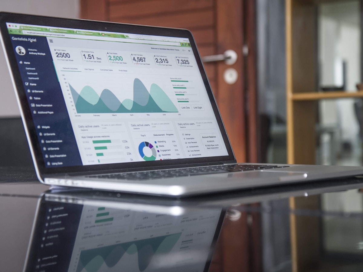
Automate the Boring Half of Your Day
Drag-and-drop triggers, branching logic, and 200+ pre-built integrations. Replace fragile scripts and weekly status meetings with workflows your whole team can read in plain English.
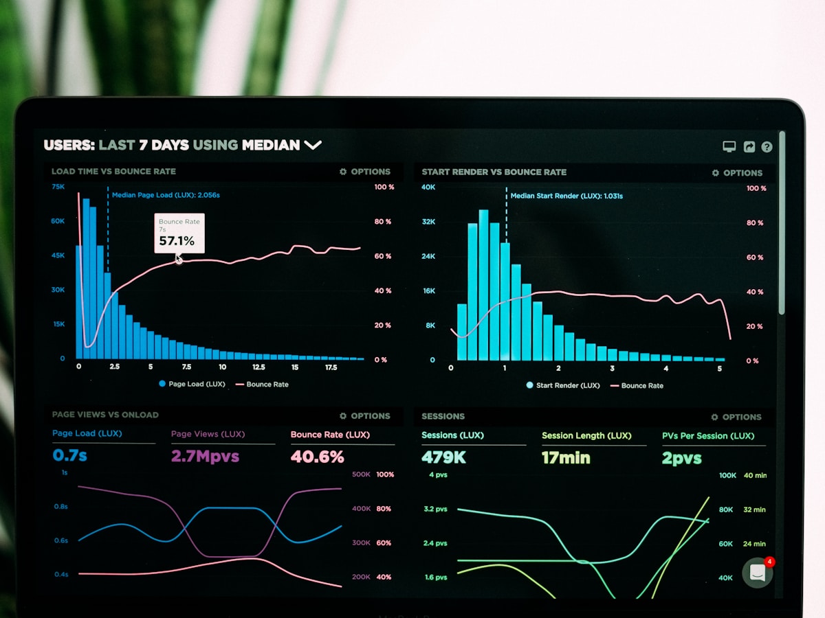
See What Actually Matters
Pre-built dashboards surface the metrics that drive revenue — without the spreadsheet circus. Slice by region, persona, or cohort in two clicks; share live links instead of stale screenshots.

Always Know Your Next Move
Personalised playbooks adapt as your team grows. Whether you're shipping your first feature or scaling past a million users, the path forward is one click away.