Liquid Lookbook Hero
The autumn and winter lookbook from Maison Oriel
Cut close to the weather.
Twenty two looks for cities where the forecast turns by the hour. Boiled wool, waxed cotton and colors lifted from harbor walls.
The autumn and winter lookbook from Maison Oriel
Twenty two looks for cities where the forecast turns by the hour. Boiled wool, waxed cotton and colors lifted from harbor walls.
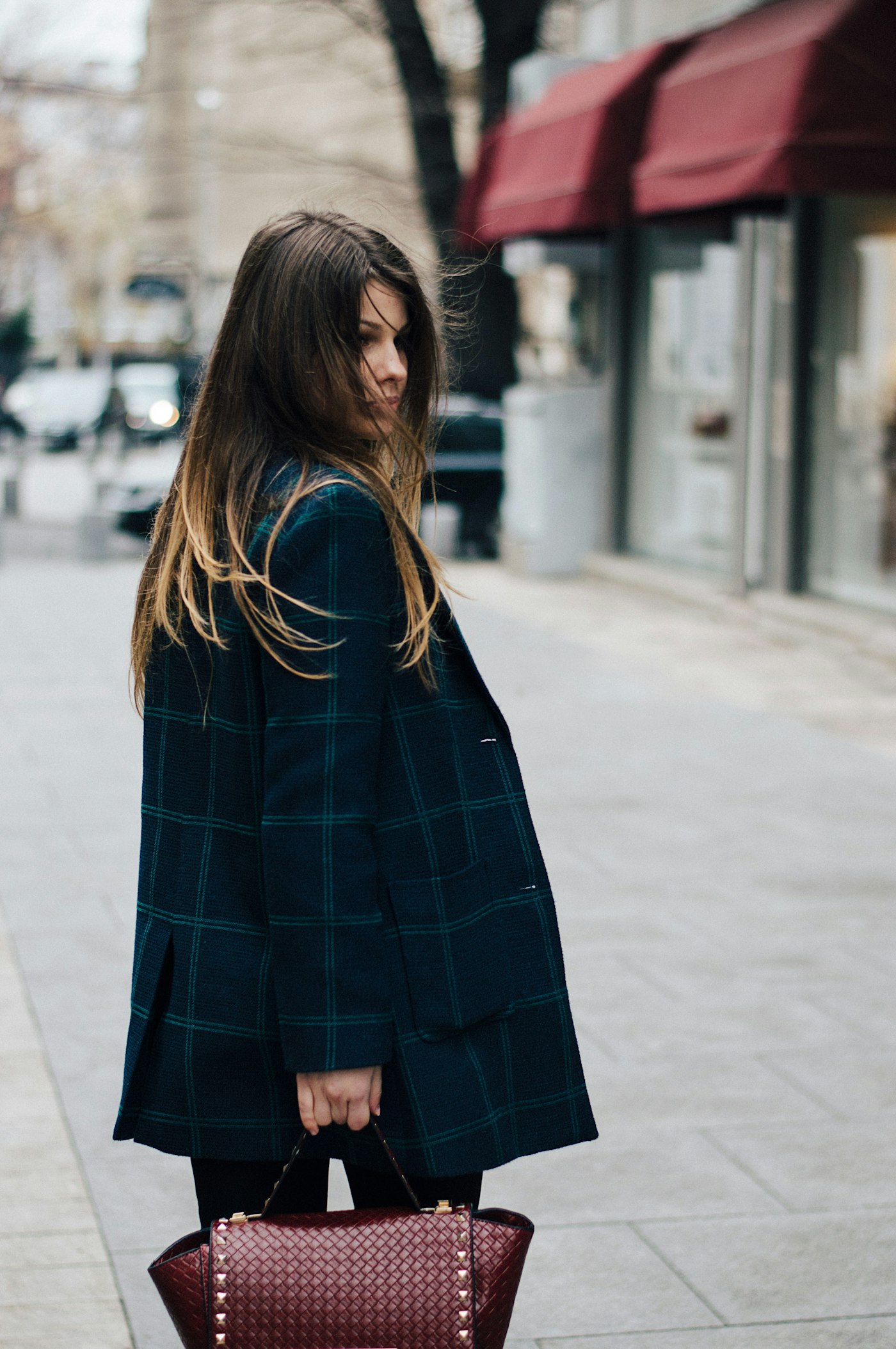
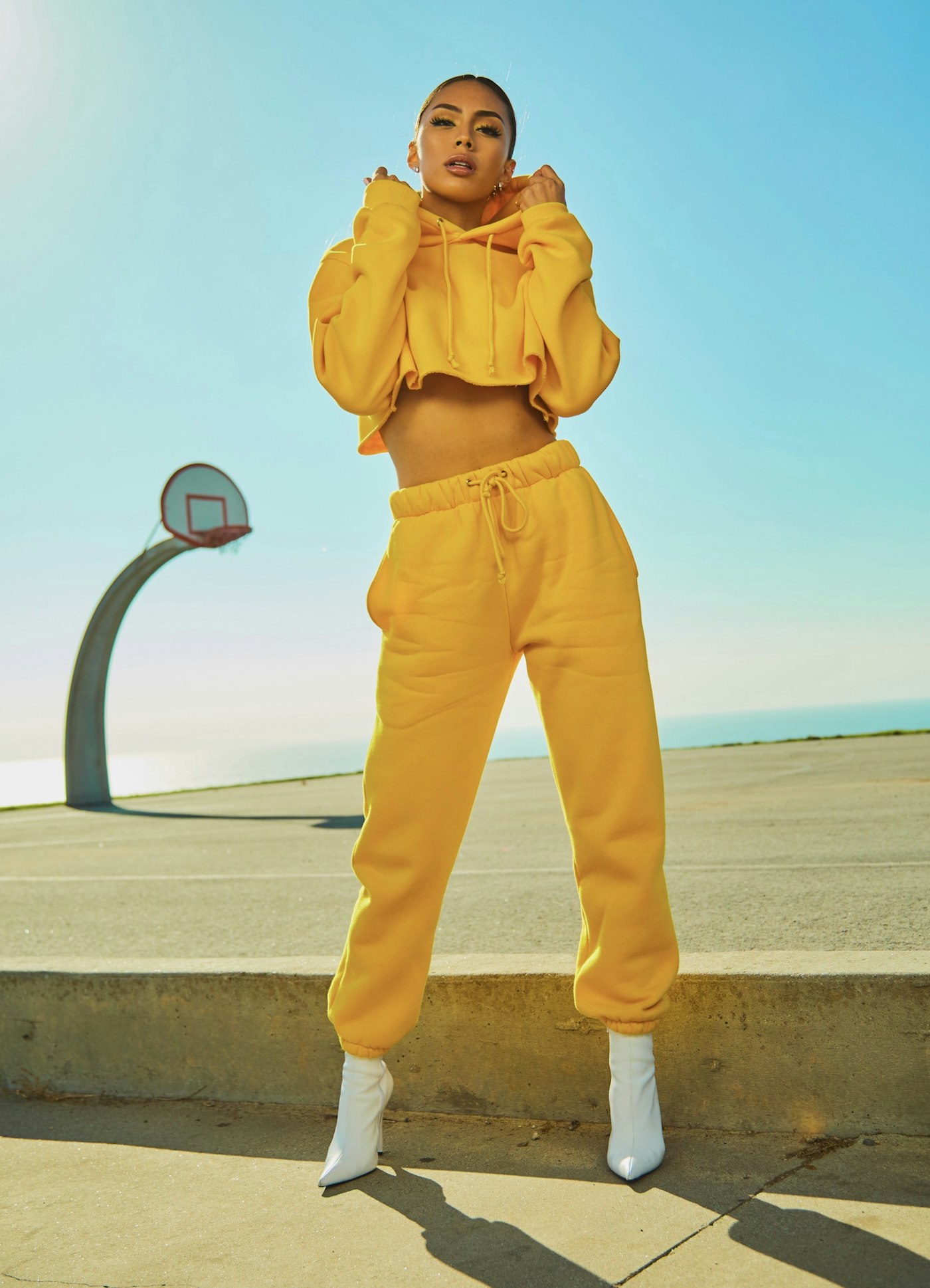
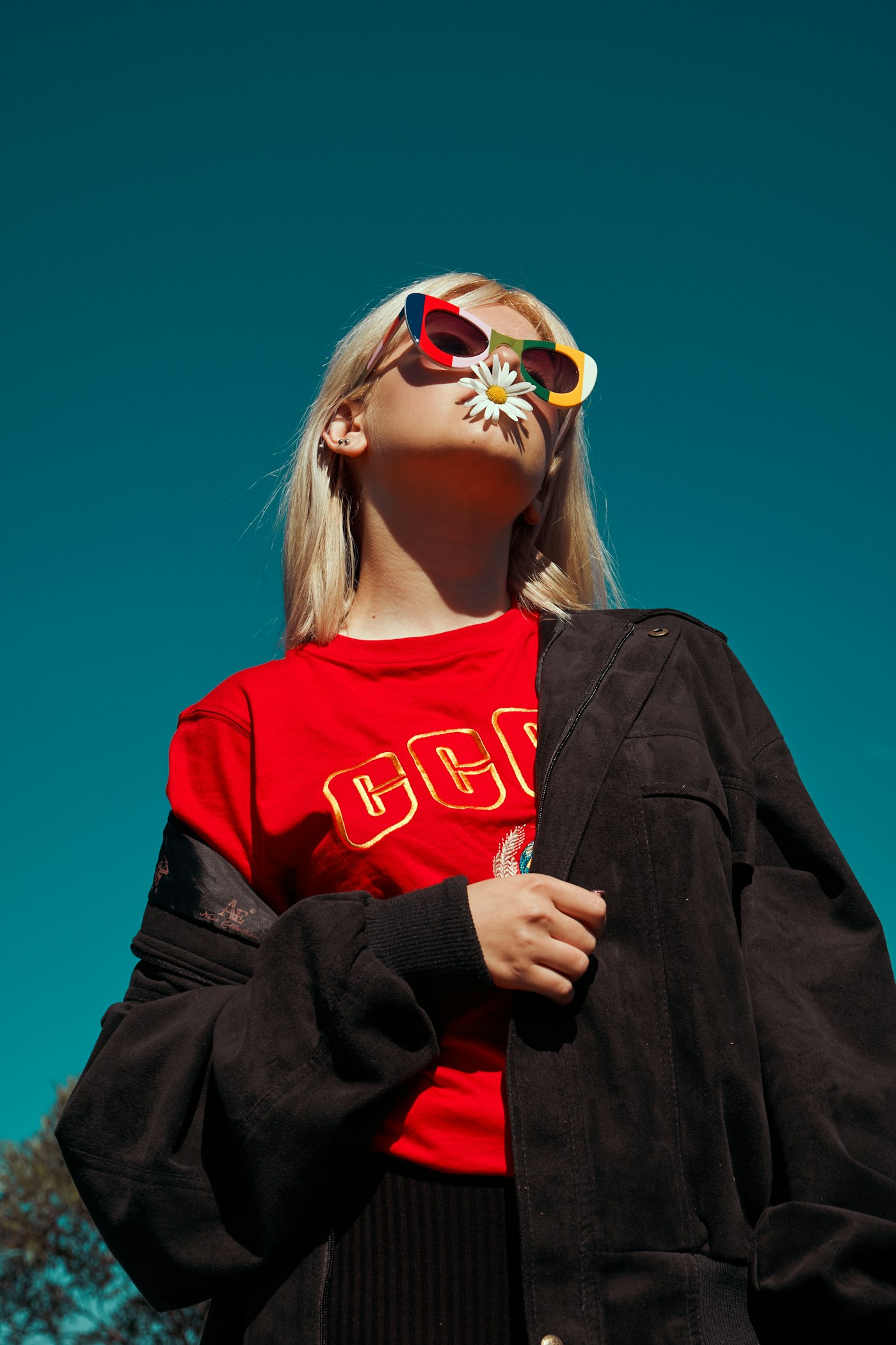
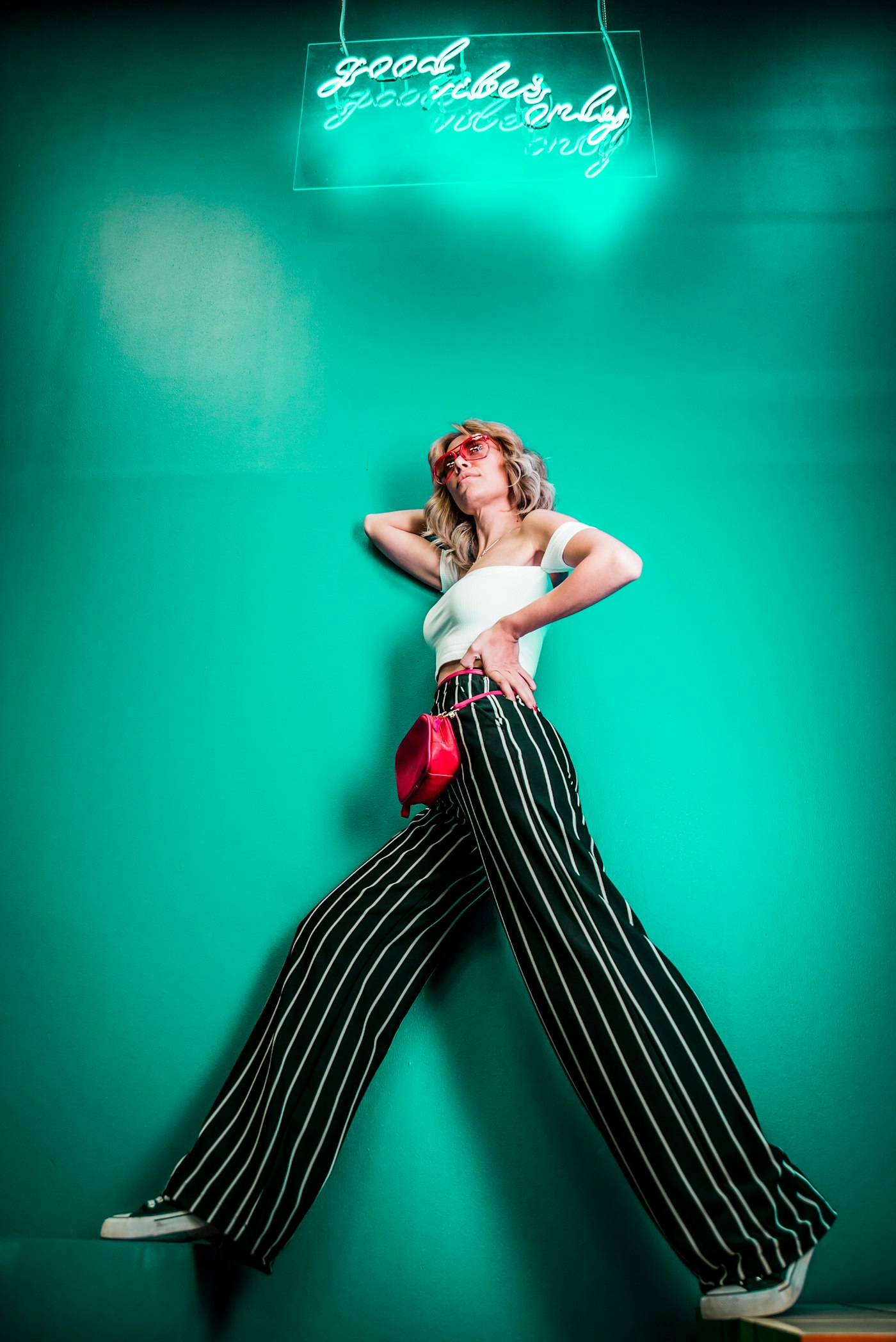
A fashion lookbook hero built on the liquid-slides component: photos swap through a noise-displaced liquid wipe with a wet rim and a slight color split, over a thin story-style timeline where shown looks stay full, the current one fills with time and the rest wait empty. Arrows, the keyboard or a click also move it, hovering holds the timer and ripples the photo. Serif copy, a Turn Arrow block button and an underline link sit beside the frame; every slideshow setting passes through the lookbook prop. It crossfades plain images without WebGL and switches instantly for reduced motion.
A lookbook hero with serif copy, a Turn Arrow block button and an underline link beside a LiquidSlides frame that swaps photos through a noise-displaced liquid wipe, with a story-style timeline, arrows, keyboard and click control.
Upgrade to Pro
Pro blocks install through the shadcn CLI with your license key and ship their full source. Docs and live previews stay open to everyone, so you can read every block's details first.
Swap YOUR_EMAIL and YOUR_KEY for the email and license key on your account. Find your license key on your account page.
Radix flavor
npx shadcn add "https://ui.beste.co/r/hero214?email=YOUR_EMAIL&license_key=YOUR_KEY"Base UI flavor
npx shadcn add "https://ui.beste.co/r-base/hero214?email=YOUR_EMAIL&license_key=YOUR_KEY"This installs the block to components/beste/block/hero214.tsx plus the liquid-slides component and the button24 and button2 buttons it uses.
The installed file exports hero214Demo alongside the block: the exact props behind the preview above. Spread it to get a working hero in one line.
import { Hero214, hero214Demo } from "@/components/beste/block/hero214";

export default function Page() {
  return <Hero214 {...hero214Demo} />;
}
Then replace the demo with your own props. Written out, a trimmed setup looks like this:
import { Hero214 } from "@/components/beste/block/hero214";

export default function Page() {
  return (
    <Hero214
      eyebrow="The autumn and winter lookbook"
      heading="Cut close to the weather."
      description="Boiled wool, waxed cotton and colors lifted from harbor walls."
      buttons={[
        { label: "Shop the collection", href: "https://beste.co" },
        { label: "Book a fitting", href: "/fittings" },
      ]}
      slides={[
        {
          src: "https://images.unsplash.com/photo-1509631179647-0177331693ae?w=1400&q=80",
          alt: "A model in wide striped trousers leaning on a teal wall",
        },
        {
          src: "https://images.unsplash.com/photo-1485968579580-b6d095142e6e?w=1400&q=80",
          alt: "A woman in a dark check coat walking down a city street",
        },
      ]}
      lookbook={{
        interval: 6,
        transition: 1.5,
        labels: { carousel: "Lookbook", previous: "Previous look", next: "Next look" },
      }}
    />
  );
}| Prop | Type | Default | Description |
|---|---|---|---|
eyebrow | string | – | Small line above the headline |
heading | string | – | Serif headline, rendered as the page h1 |
description | string | – | Intro paragraph under the headline |
buttons | ActionButton[] | [] | The first renders as a Turn Arrow block button (Button24), the rest as underline links (Button2) |
slides | LiquidSlide[] | [] | Photos in the slideshow; the frame is skipped when empty |
lookbook | Omit<LiquidSlidesProps, "slides" | "className" | "children"> | – | Forwards LiquidSlides props: interval, transition, distortion, noiseScale, colorSplit, zoom, autoplay, pauseOnHover, progress, arrows, labels, interactive, paused |
className | string | – | Extra classes for the outer <section> |
type ActionButton = {
  label: string;
  href: string;
};

type LiquidSlide = {
  src: string;
  alt: string;
};lg the grid is 5 columns of copy and 7 of frame, aligned to the bottom. The frame is 4:5 below lg, then as tall as the viewport minus 78px and 8rem, capped at 820px.pauseOnHover) and ripples the photo (with interactive). Arrows, the keyboard and a click also move the slideshow, and labels names the carousel and its buttons for screen readers.clipPath over 1.6s, and the copy rises in with delays from 0.05s to 0.4s.