Collage Hero
Polaris Studio
We build brands that refuse to blend in.
Polaris is a creative studio shaping identities, websites, and campaigns for ambitious teams. We obsess over craft so your work lands the moment people see it.


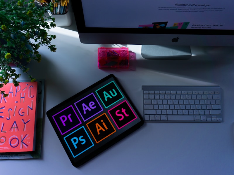

Polaris is a creative studio shaping identities, websites, and campaigns for ambitious teams. We obsess over craft so your work lands the moment people see it.
Split studio hero with a two-tone headline and a four-image arranged collage.
Split studio hero pairing a two-tone headline, description and dual CTAs with a uniform 2x2 image collage on the opposite column. Each collage tile is a fixed square with its own hover zoom, keeping the grid tidy rather than an irregular masonry layout.
Upgrade to Pro
Pro blocks install through the shadcn CLI with your license key and ship their full source. Docs and live previews stay open to everyone, so you can read every block's details first.
Swap YOUR_EMAIL and YOUR_KEY for the email and license key on your account. Find your license key on your account page.
Radix flavor
npx shadcn add "https://ui.beste.co/r/hero114?email=YOUR_EMAIL&license_key=YOUR_KEY"Base UI flavor
npx shadcn add "https://ui.beste.co/r-base/hero114?email=YOUR_EMAIL&license_key=YOUR_KEY"This installs the block to components/beste/block/hero114.tsx, the badge6 component it uses for the eyebrow label, the button1 component it uses for the primary CTA pill, and their dependencies.
The installed file exports hero114Demo alongside the block: the exact props behind the preview above. Spread it to get a working hero in one line.
import { Hero114, hero114Demo } from "@/components/beste/block/hero114";

export default function Page() {
  return <Hero114 {...hero114Demo} />;
}
Then replace the demo with your own props. Written out, a trimmed setup looks like this:
import { Hero114 } from "@/components/beste/block/hero114";

export default function Page() {
  return (
    <Hero114
      label="Northwind Studio"
      heading="Identity systems that <strong>ship and scale.</strong>"
      description="From first sketch to full brand system, built for teams that move fast."
      buttons={[
        { label: "Start a project", href: "https://beste.co", variant: "primary" },
        { label: "View our work", href: "https://beste.co", variant: "outline" },
      ]}
      images={[
        {
          src: "https://images.unsplash.com/photo-1558655146-d09347e92766?w=800&h=800&fit=crop",
          alt: "Color swatches arranged on a studio desk",
        },
        {
          src: "https://images.unsplash.com/photo-1561070791-2526d30994b5?w=800&h=800&fit=crop",
          alt: "Poster pinned to a studio wall",
        },
        {
          src: "https://images.unsplash.com/photo-1626785774573-4b799315345d?w=800&h=800&fit=crop",
          alt: "Team sketching ideas during a workshop",
        },
      ]}
    />
  );
}| Prop | Type | Default | Description |
|---|---|---|---|
label | string | – | Eyebrow text rendered through Badge6 |
heading | string | – | Headline HTML; wrap a phrase in <strong> to render it muted |
description | string | – | Supporting paragraph, capped at max-w-xl |
buttons | ActionButton[] | [] | CTA row; primary renders as a solid pill, outline as a bordered link |
images | ImageItem[] | [] | Collage tiles; only the first 4 are rendered |
className | string | – | Extra classes for the outer <section> |
type ActionButton = {
  label: string;
  href: string;
  variant?: "primary" | "outline";
};

type ImageItem = {
  src: string;
  alt: string;
};grid-cols-2 grid; images is sliced to images.slice(0, 4), so passing more than four is silently truncated and passing fewer leaves that many cells simply absent rather than backfilled.group/hero114 hover, independent of its siblings: object-cover image scales to 105% over 500ms on hover of that specific cell.primary button variant goes through Button1; outline is a hand-built bordered Link with uppercase, letter-spaced text, so its focus and hover styling is defined locally in this component rather than inherited from Button1.lg breakpoint; below that, copy and collage stack vertically with the copy first.hero112
Two-column studio hero with a two-tone headline, dual CTAs, tall image and a client wordmark strip.
hero166
An editorial hero that breaks its display heading across two lines and slots a square image tile floating a live payment card into the gap, with the paragraph and action landing under a hairline.
hero121
Split hero with a big headline and CTA on the left, a divided vertical stat rail on the right, and a full-width wide image strip below.
hero159
A centered hero with an eyebrow, light display heading, and two actions above a staggered three-photo collage whose raised middle tile floats a live booking confirmation.