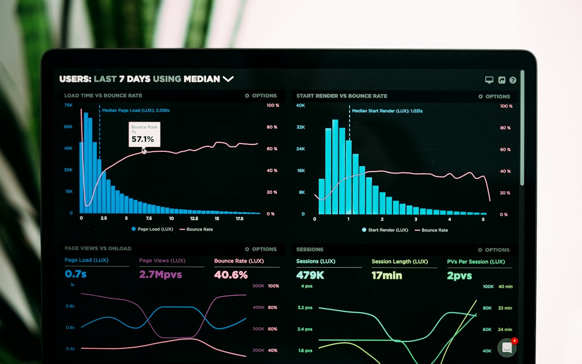
Every dollar gets a job and a number to hit. We instrument the full funnel first, so the moment budget moves, we can already see whether the market moved with it. No guessing, no vanity metrics, just the signal that actually drives revenue.
Interactive principle list that swaps a detail panel with image as each is hovered.
Agency17: Principles Selector
Interactive list of studio principles where hovering, focusing, or clicking a title swaps a sticky detail panel's copy and cross-fades to that principle's photo, so the panel never mounts or unmounts, only the active image's opacity changes.
Upgrade to Pro
Pro blocks install through the shadcn CLI with your license key and ship their full source. Docs and live previews stay open to everyone, so you can read every block's details first.
This installs the block to components/beste/block/agency17.tsx, the badge6 component it uses for the section eyebrow, and its dependencies.
Quick start
The installed file exports agency17Demo alongside the block: the exact props behind the preview above. Spread it to get a working principles section in one line.
tsx
import { Agency17, agency17Demo } from "@/components/beste/block/agency17";export default function AboutPage() { return <Agency17 {...agency17Demo} />;}
Then replace the demo with your own props. Written out, a trimmed setup looks like this:
tsx
import { Agency17 } from "@/components/beste/block/agency17";export default function AboutPage() { return ( <Agency17 label="How We Work" heading="Three principles that shape every project we ship" principles={[ { title: "Measure before you spend", description: "Every dollar gets a job and a number to hit before it moves.", image: { src: "https://images.unsplash.com/photo-1551288049-bebda4e38f71?w=1200&h=750&fit=crop", alt: "Analytics dashboard charting performance", }, }, { title: "Creative is the variable", description: "Targeting plateaus fast; the creative is where the leverage lives.", image: { src: "https://images.unsplash.com/photo-1492691527719-9d1e07e534b4?w=1200&h=750&fit=crop", alt: "Designers reviewing creative concepts on a wall", }, }, ]} /> );}
Props
Prop
Type
Default
Description
label
string
–
Eyebrow text rendered in Badge6
heading
string
–
Section heading
principles
Principle[]
[]
List entries; hovering/clicking one drives the detail panel
Selection state (active, defaulting to index 0) is driven by onMouseEnter, onFocus, and onClick on each list button, so keyboard tabbing and pointer hover both switch the panel, not just clicking.
The detail panel is lg:sticky lg:top-24, staying pinned in the viewport while the list scrolls alongside it on tall pages.
Every principle's image is rendered simultaneously, stacked with absolute inset-0; only opacity (0 or 100, 500ms transition) toggles per image, so switching principles cross-fades instead of swapping src.
The active list item's index and title turn text-primary; inactive items only pick up text-primary on hover via group-hover/agency17.
Index numbers are zero-padded (01, 02, …) regardless of how many principles are passed.
Ruled, expandable capability rows with oversized type, detail copy, and monospace tag chips.
PRO
agency13
How We Think
Sticky studio intro with a portrait beside a stack of numbered principles.
FREE
agency24
Studio Brief With Changing Plate
A four-step studio brief where the tall photograph beside it changes with the question on screen, each with its own caption, and sending the brief swaps the plate for the studio and the form for a ledger of the answers.
PRO
agency16
Studio At A Glance
Studio overview pairing facts, copy and highlight stats with a clean studio image.
PRO
agency15
Awards List
Editorial list of studio awards by year with project and recognition details.
PRO
agency23
Numbered Services List
A services section with an eyebrow over a hairline rule, a two-column heading, and an editorial list of monospace-numbered service rows split into title and description.