Interactive Pillar Tabs & Image
Our Approach
Three pillars that define everything we do
We believe great architecture starts with understanding people, place, and purpose.


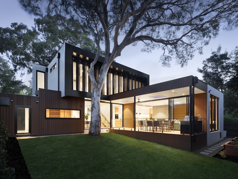
We believe great architecture starts with understanding people, place, and purpose.
Centered header with interactive hover tabs that crossfade a side image. Accordion descriptions and sliding accent line. For studios and agencies.
Centered header above an interactive two-column layout: a vertical list of pillar tabs on the left, and a single image on the right that crossfades between each pillar's photo as the visitor hovers or clicks a tab. Built for studios and agencies that want to walk through a handful of core principles.
Upgrade to Pro
Pro blocks install through the shadcn CLI with your license key and ship their full source. Docs and live previews stay open to everyone, so you can read every block's details first.
Swap YOUR_EMAIL and YOUR_KEY for the email and license key on your account. Find your license key on your account page.
Radix flavor
npx shadcn add "https://ui.beste.co/r/about26?email=YOUR_EMAIL&license_key=YOUR_KEY"Base UI flavor
npx shadcn add "https://ui.beste.co/r-base/about26?email=YOUR_EMAIL&license_key=YOUR_KEY"This installs the block to components/beste/block/about26.tsx and the badge and button shadcn/ui primitives it depends on.
The installed file exports about26Demo alongside the block: the exact props behind the preview above. Spread it to get a working about section in one line.
import { About26, about26Demo } from "@/components/beste/block/about26";

export default function AboutPage() {
  return <About26 {...about26Demo} />;
}
Then replace the demo with your own props. Written out, a trimmed setup looks like this:
import { About26 } from "@/components/beste/block/about26";

export default function AboutPage() {
  return (
    <About26
      badge={{ label: "Our Approach", variant: "secondary" }}
      heading="Three pillars that define everything we do"
      description="We believe great architecture starts with people, place, and purpose."
      pillars={[
        {
          title: "People",
          description: "Every space begins with the people who will inhabit it.",
          image: {
            src: "https://images.unsplash.com/photo-1517048676732-d65bc937f952?w=800&h=600&fit=crop",
            alt: "Team collaborating in a modern office",
          },
        },
        {
          title: "Place",
          description: "Context is everything: light, land, climate, and culture.",
          image: {
            src: "https://images.unsplash.com/photo-1486406146926-c627a92ad1ab?w=800&h=600&fit=crop",
            alt: "Modern architectural building exterior",
          },
        },
      ]}
      buttons={[{ label: "View Our Work", href: "https://beste.co" }]}
    />
  );
}| Prop | Type | Default | Description |
|---|---|---|---|
badge | { label: string; variant?: "default" | "secondary" | "outline" } | – | Eyebrow badge above the heading |
heading | string | – | Centered section heading |
description | string | – | Centered lead paragraph under the heading |
pillars | PillarItem[] | [] | Tab list on the left, each with its own crossfade image |
buttons | ButtonItem[] | [] | Centered CTA row at the bottom |
className | string | – | Extra classes for the outer <section> |
type PillarItem = {
  title: string;
  description: string;
  image: { src: string; alt: string };
};

type ButtonItem = {
  label: string;
  href?: string;
  variant?: "default" | "secondary" | "outline" | "ghost" | "link" | "destructive";
};active index (useState(0), first pillar active by default). Both onMouseEnter and onClick on a pillar button set the active index, so hovering with a mouse and tapping on touch devices both work.absolute inset-0 image per pillar and crossfades between them with opacity transitions (duration-500); only the active pillar's image has opacity-100, the rest sit at opacity-0 underneath it.bg-primary/10 background and its heading switches from text-muted-foreground to text-foreground; an arrow icon slides in from -translate-x-2 opacity-0 to translate-x-0 opacity-100 only on the active row.lg:grid-cols-[1fr_1.5fr], so the image column is one and a half times as wide as the tab list on large screens; below lg the grid falls back to a single stacked column (tabs, then image).about32
Centered heading with description, followed by two images side-by-side. Configurable image ratio (equal, left larger, right larger). Always horizontal on mobile.
about59
Centered parenthetical eyebrow and a large statement heading, followed by a three-up row of icon pillars pairing a circular icon with a title and one-line description.
about29
Centered header with wide panoramic image, product cards with layered attributes, and sourcing grid.
about44
Layered about over a faint scrolling studio-word marquee with offset images and stats.